← Back
RTW Investments rebrand and digital communications refresh
Brand identity and site design for life sciences investment and innovation firm
Brief
- The RTW business had grown significantly since 2009 – having refined its offer and expanded its capabilities beyond that of its original hedge fund roots. Now with the RTW Charitable Foundation, RTW Venture Fund, internal innovation labs, and a growing portfolio of companies from preclinical to commercial status, there was a need to craft a refreshed brand to reflect the business' journey and support future-looking aspirations and growth.
- RTW is a selective business of smart, humble and dedicated people who take a collaborative approach in all that they do. This comes to life in their core thought ‘Our power of conviction’ and their four key characteristics: Direction, Insight, Unexpected and Precise.
- Together these elements communicate RTW as a collective, with confidence and clarity of thought. Their deep research and ability to think differently, to identify and create unique opportunities that others may miss alongside their rigorous and meticulous nature deliver game-changing positive impacts for patients and partners alike.
Tasks
- Through analysis of the business and online client workshop discussion we developed the core thought “our power of conviction” – a visual representation of the coming together of scientists, entrepreneurs, and investors that identify unique opportunities and breakthrough therapies that transform millions of lives – and landed a new messaging framework for the business.
- Using this core thought as a starting point, I ran a client workshop via Mural and defined a new information architecture that focussed on creating ‘storytelling’ sections, putting the team front and centre and highlighting how different skill sets and expertise come together to develop solutions.
- Domain name research and recommendations for the RTW Investment and Charitable Foundation websites, involved using a domain name checker to test the possible configurations of root and top-level domains.
- Channel strategy planning involved researching and auditing existing channel content, editorial calendar and communications strategy plan to draw out themes and topics in line with the new brand messaging framework and develop a 6 month channel matrix.
Action
- Having developed, present and agreed the new sitemap with the client, I scamped out key pages, features and modules for the new site design and layout through wireframes.
- I developed content guides for all the landing pages, determining module type, hierarchies and SEO keywords.
- This UX thinking fed into the content creation process of trawling through existing company documentation to draw out the hidden innovation success stories and people stories that sat at the core of the RTW business and which needed to be better articulated and copy edited.
- We tested a strawman theme and channel matrix and made recommendations for content and campaign development in the run up to website launch and for the first six months of activity post-launch.
- Through the consultation process, we identified the need for a Website Manager role to be implemented with the Communications team in order to manage the ongoing website content and maintenance.
- One of the main brand deliverables we needed to create was a short film for use on the website (and beyond) to demonstrate RTW’s purpose in a succinct and engaging way.
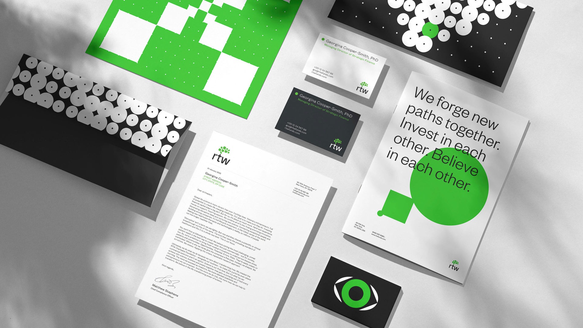
- The shapes used to create the mark are dynamic and organic, whilst the letterforms feel robust and precise. We worked with F37 Foundry to finesse the logo, crafting the forms of the mark and the interplay of the characters.
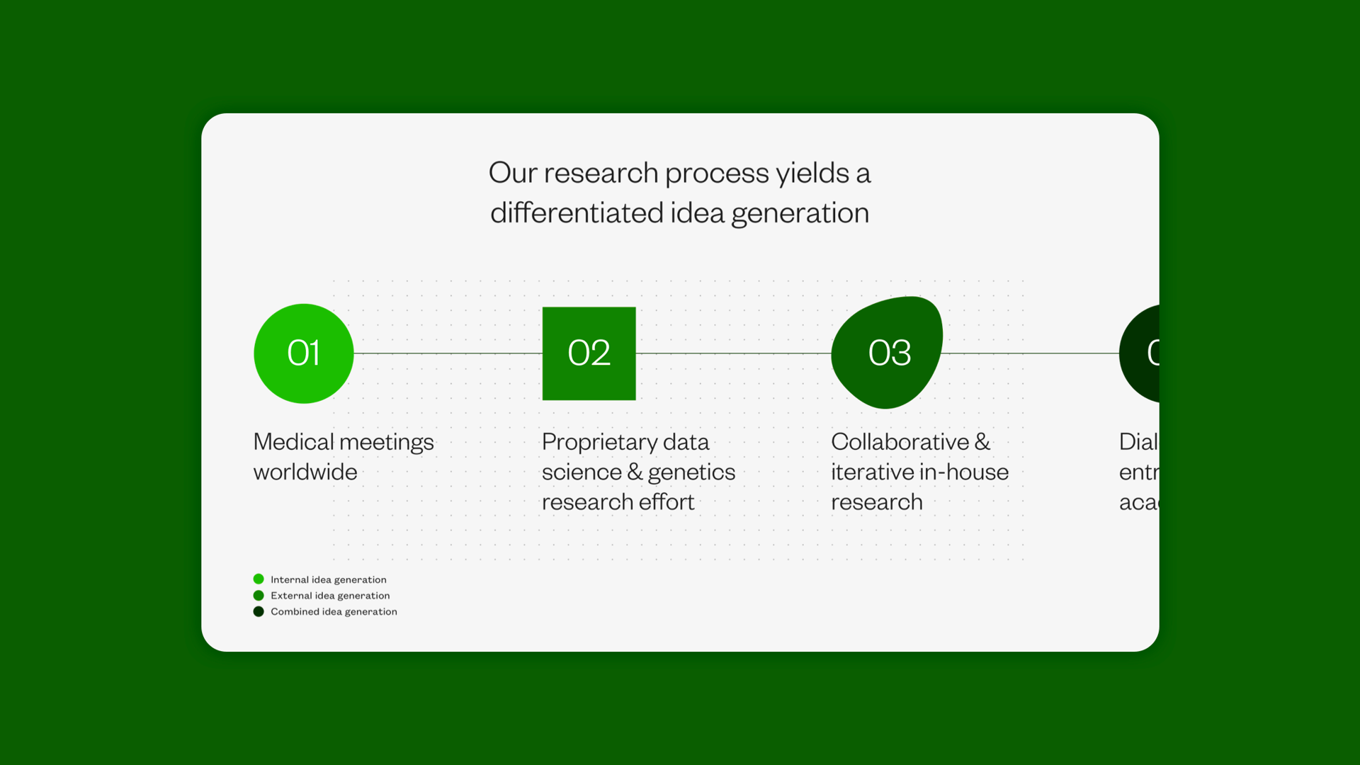
- Central to this is a collective of four elements – a rigorous dot grid, focused circle, robust square and an amorphic, human shape – representing the collaborative nature of RTW as well as celebrating the individuals.
- The dot grid symbolises the company’s mathematical, meticulous approach – this forms the foundation of their business and the graphic language, with all shapes and movements stemming from it.
Results
- A balance of brand application and usability resulted in an integrated website experience that immerses users in the important work that RTW do.
- Bringing the brand to life and ensuring its effective application across an extensive digital ecosystem meant taking a concise yet sophisticated approach.
- Large typography, immersive imagery, and engaging interaction of content were paired with a confident use of the graphic language to make the digital experience both identifiably RTW and as simple to use as possible.
- Applying the rigours of the digital and content strategy disciplines to the project ensured that the resulting website not only engaged users visually, but also through the storytelling content and overall user experience.
- Through the development of the 6 month channel matrix, RTW were able to elevate their communications through relevant and well timed messages and content. We helped ideate campaigns and the RTW team then executed the design and delivery.


Post a comment